
728x90

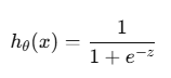
1.로지스틱 회귀(Logistic Regression)
분류 문제를 해결하기 위한 통계적 모델
데이터 입력에 따라 특정 클래스에 속할 확률을 예측하는 데 사용한다.
출력 값이 연속적인 값이 아니라 0과 1 사이의 확률로 나타난다.
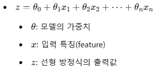
2.시그모이드 함수(Sigmoid function)
실수 값을 0과 1 사이의 값으로 변환하는 비선형 함수이다.
이진 분류 문제에서 출력값을 확률로 해석하기 위해 사용한다.
import numpy as np
import pandas as pd
import matplotlib.pyplot as plt
from sklearn.model_selection import train_test_split
from sklearn.linear_model import LogisticRegression

# 1. 데이터 생성 (성적과 통과 여부)
data = {
    "Score": [35, 50, 65, 70, 85, 40, 60, 75, 90, 45],
    "Pass": [0, 0, 0, 1, 1, 0, 1, 1, 1, 0],  # 1: 통과, 0: 불통과
}
df = pd.DataFrame(data)

X = df[["Score"]]  # 입력: 성적
y = df["Pass"]     # 출력: 통과 여부

# 2. 데이터 분리
X_train, X_test, y_train, y_test = train_test_split(X, y, test_size=0.2, random_state=42)

# 3. 로지스틱 회귀 모델 정의 및 학습
model = LogisticRegression()
model.fit(X_train, y_train)

# 4. 예측 확률 계산
scores = np.linspace(30, 100, 300).reshape(-1, 1)  # 30점부터 100점까지 데이터 생성
probabilities = model.predict_proba(scores)[:, 1]  # 클래스 1(통과)의 확률

# 5. 시각화
plt.figure(figsize=(8, 6))

# 학습 데이터 산점도
plt.scatter(df["Score"], df["Pass"], color="blue", label="Training Data", zorder=5)

# 로지스틱 회귀 모델의 예측 확률 곡선
plt.plot(scores, probabilities, color="red", label="Logistic Regression Curve", linewidth=2)

# 그래프 꾸미기
plt.axhline(0.5, color="gray", linestyle="--", label="Decision Boundary (0.5)")
plt.title("Logistic Regression: Score vs Pass Probability")
plt.xlabel("Score")
plt.ylabel("Pass Probability")
plt.legend()
plt.grid(True)

# 그래프 출력
plt.show()
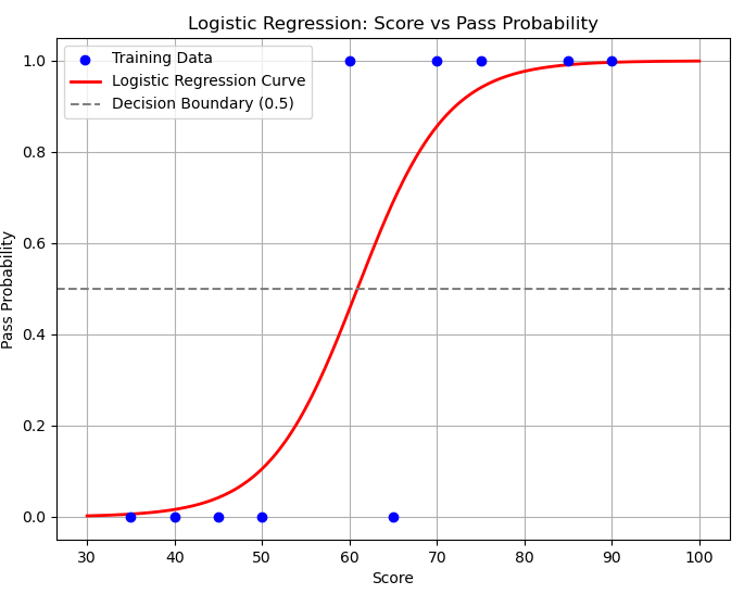
다음 그래프는 위의 예제의 결과이다.
학습데이터 파란점을 토대로 나오게된
로지스틱 회귀 모델이 예측한 시그모이드 함수(Sigmoid Function)형태의 확률이다.
3.로지스틱 회귀의 비용 함수(Cost function)
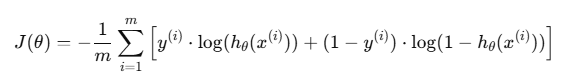
- 는 비용 함수
- m은 데이터 샘플의 수
- y(i)는 샘플 ii의 실제 레이블 (0 또는 1)
- hθ(x(i))는 모델이 예측한 샘플 i의 클래스 1(통과) 확률.
- θ는 모델의 파라미터 (가중치)
728x90
'AI' 카테고리의 다른 글
| [AI] 소프트맥스 회귀(Softmax Regression) (0) | 2024.12.30 |
|---|---|
| [AI] 시계열 데이터(Time Series Data) (1) | 2024.12.28 |
| [AI] 경사하강법(Gradient Descent) (0) | 2024.12.28 |